The Root Coworking Visual Identity
The Root is a coworking company with spaces in Tulsa and Omaha, built on hospitality: thoughtful workspaces where flexibility and support help anyone who walks through the door grow.
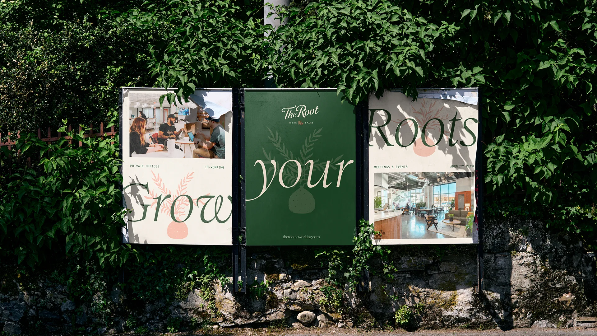
Its original brand had carried the business well and earned real equity. As The Root grew and launched location brands like Builders, it was ready for an identity that felt the way its spaces do. We refined the mark, drew a new wordmark, softened the palette and carried the system from the front door to the website.
Visit live website ↗The brief was an evolution. We realized we needed a revolution. Working closely with The Root’s team, we found the real story: a host, not an office. The identity needed to feel warm, rooted and lived-in, not just cleaner.
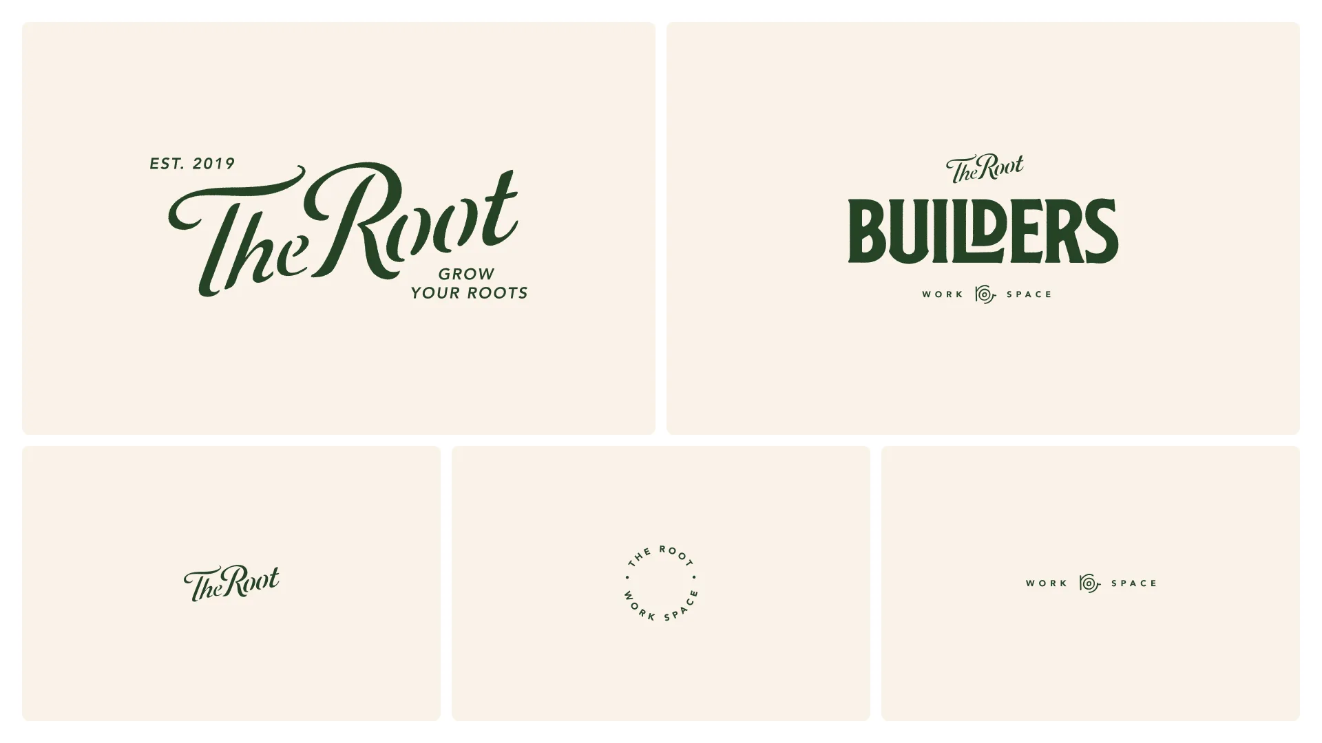
We kept the equity in the original mark and redrew it by hand. A flowing script wordmark, a palette taken from the spaces and a welcoming voice do the job a good host does.
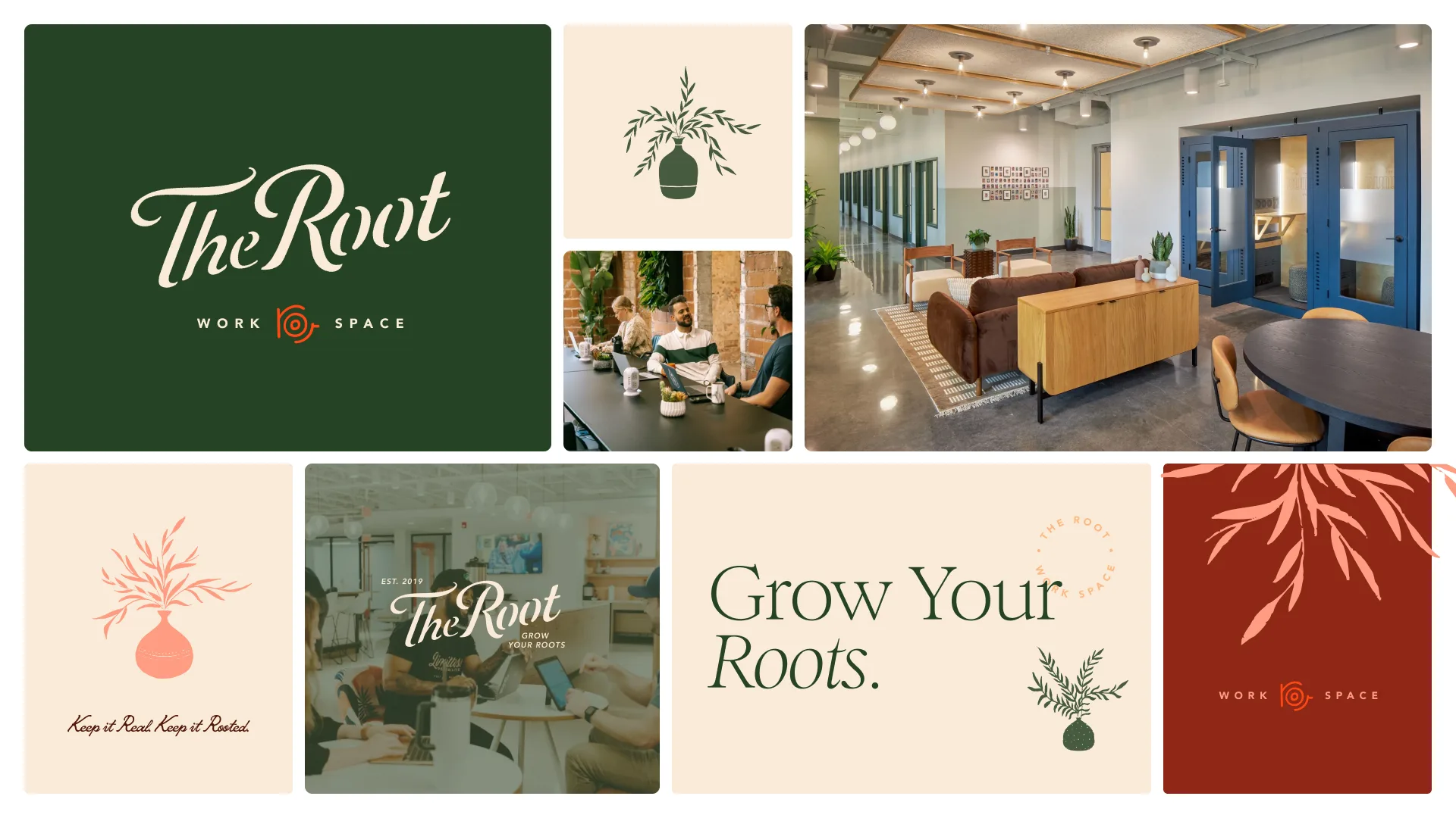
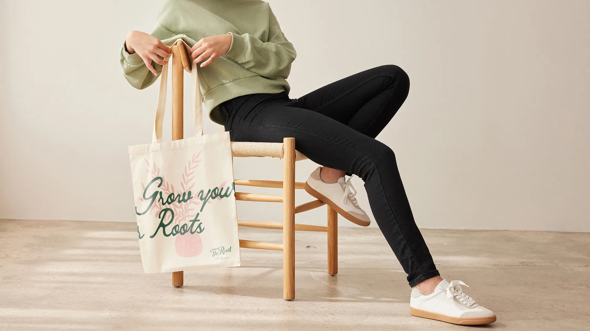
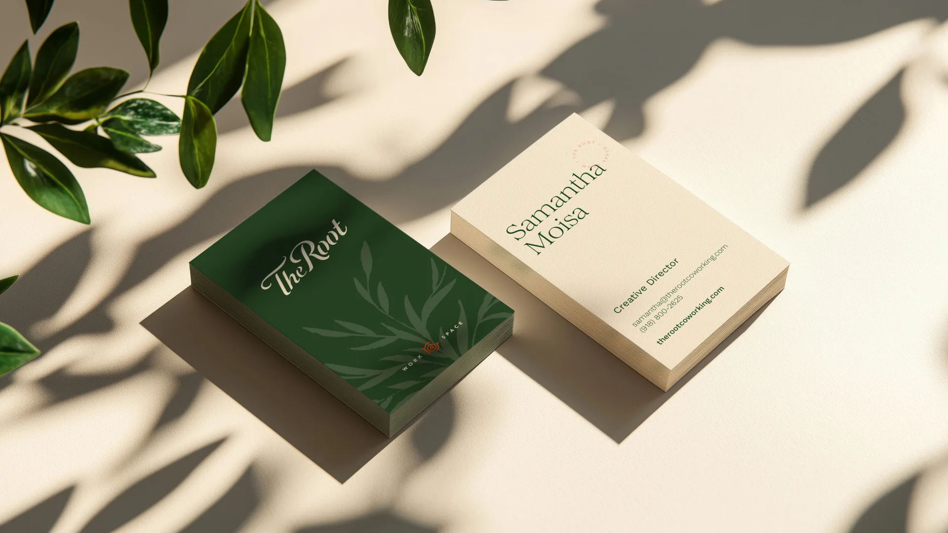
A set of hand-drawn illustrations carries the name into everything else: potted plants, leafy sprigs and trailing branches, drawn with the same loose, warm line as the wordmark. They’re the houseplants of the brand. They sit in the corner of a business card, spill across a tote, frame a sign or fill a terracotta panel, so the system always feels tended and alive, the way the spaces do.
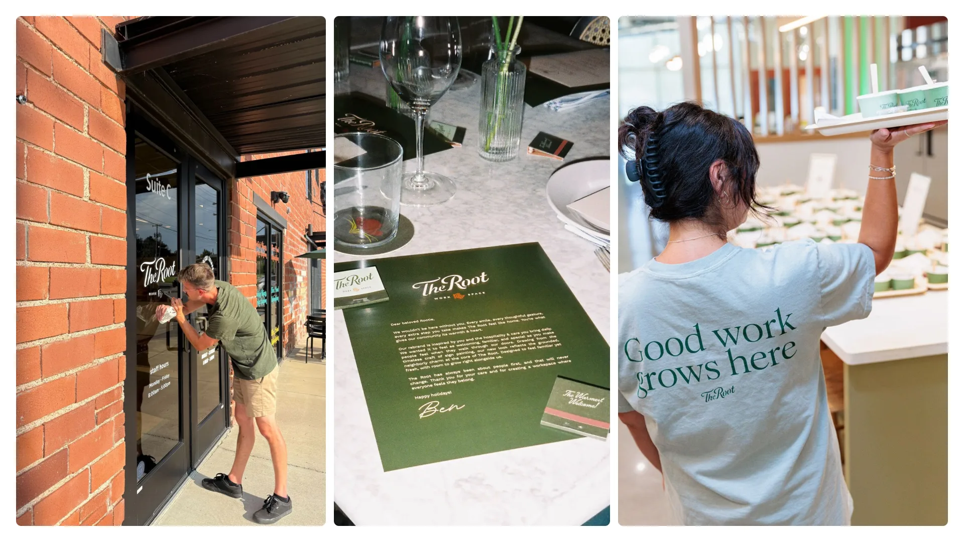
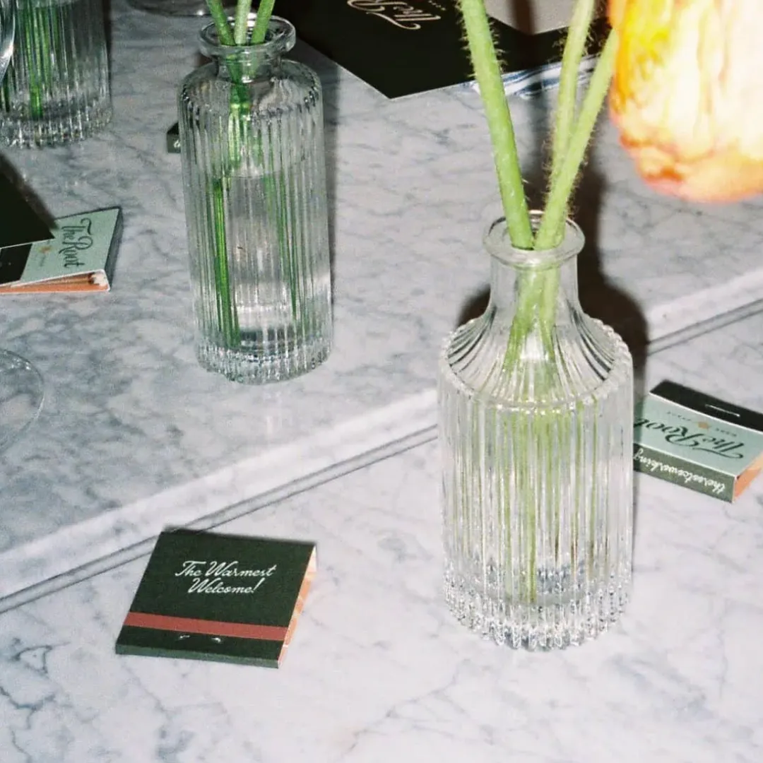
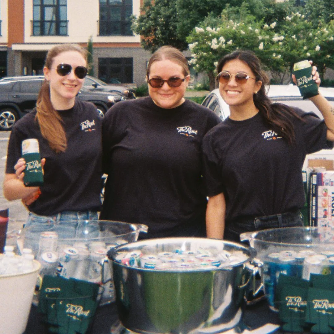
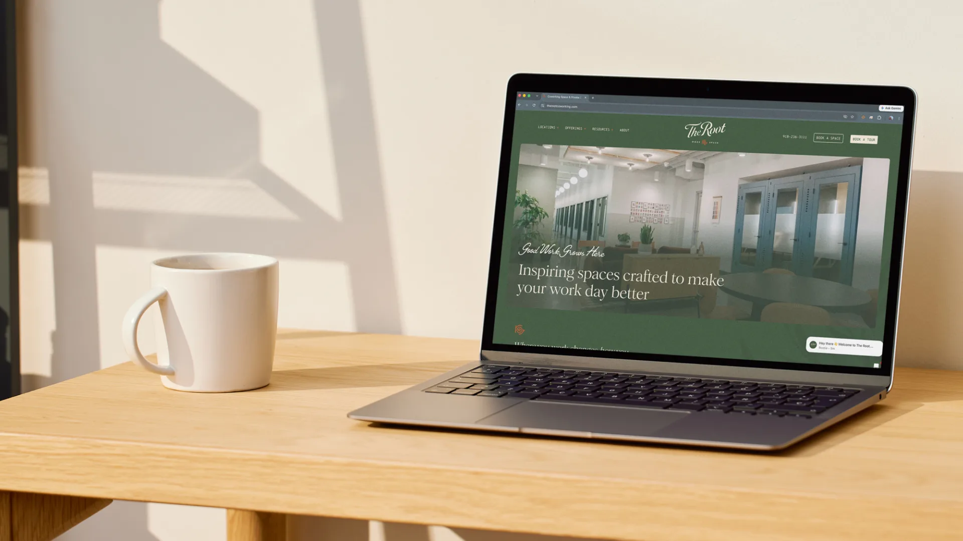
The system lives where people gather: a hand-painted door at Market Station, signage, matchbooks at member dinners, totes, tees and the new website.